Friday, 25 December 2009
Sunday, 6 December 2009
Term is over…
Over the next month or so I will be attending a few exhibitions, which have been recommended to me by my tutor.
I also will be attempting to design my website, hopefully getting that up and running in the January if time permits
I will post my progress as and when…
The Results are in…
I was given my mark for the radio project. I have to say after a shakey start to the project I turned it round and got a decent mark. The finished radio and all my photos, presentation boards came out well and I was really happy with what I submitted. The idea of the manual was well received (thanks to an outside source for that), not so much from fellow student because they thought I was being a bit too clever.
I am really pleased with the outcome of the project, I felt good I would get a good mark, like a C+ or B, but I got an A. Only two other people got an A out 28 people so I couldn’t of done much more.
Hopefully it will continue to the next 2 and half years, below is what I submitted, enjoy…

The stu-stu-studio…
One of the most productive skill / technique that I learnt was how to create professional photos of our products at home. It is an easy and inexpensive way of getting great photos.
All you need to do is get a large box and cut holes in the top and the sides. Cover those holes with tracing paper to diffuse the light. Then put a piece of white paper in the back, tape at the top and leave loose to create a curve. Then all you need is a lamp and darken room, I was told that natural light is better but I found that a lamp gives just as good results.
It also depends on the settings on your camera or you do a little photoshop trickery.

Project No.2
I started off by gathering boxes and wrapping them in white paper to hide the details of the boxes so I can draw them and to get the shadows of the boxes. I then picked a box and took it apart and measured the net.
I then got a random net that someone else drew to draw on SoildWorks, the one I got was completely wrong and just made it up. SolidWorks is a program that most agencies use, you can draw 2d images such as nets and also it is a 3d program.
The next step was to draw the components that was ordered from a website. We also had a workshop in typography, which was fun but a bit of waste of time to be honest.
The final results to come…
Tuesday, 3 November 2009
How the Brief was won!!!!!!!!!!
The brief we came up with after our research presentation was…
How to help the NUS empower & involve students?
We decided to re-brand the NUS, as we found out that the younger students have never heard of this organisation due to them having no presence around the university.
There are no posters, no advert on uni intranet, no one really telling us what and who they are.
The NUS I think are seen as a old organisation that doesn’t understand students, even though it is ran by students. Not many student actually know this, students need to be made aware of the services and benefits that the NUS provide.
So we designed a new logo…

We also made a new NUS card…

and also we decide to create an event that happens at freshers week to raise awareness of the NUS and what can do for students.
That was our solution I think that it was quite successful and maybe with a huge amount of work we could make this idea a real possibility.
Sunday, 11 October 2009
The First Project... Research
The project is going well, we don’t even think of ideas yet. The project at the moment is just research based, we have to research certain groups that are affected by freshers week. Our group has selected students and event promoters, we thought it could be quite interesting to see if there is a connection between the two and to see if we can come up for a solution to benefit both groups.
I have never really done much research when studying but I am seeing the benefits of research. It does open up some many doors and has opened my eyes to research. Also I have had a chance to get creative with the presentation, I hope everyone likes it.
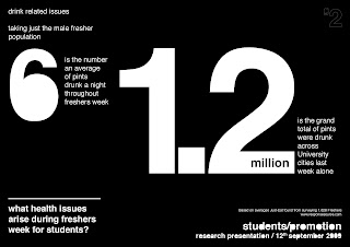
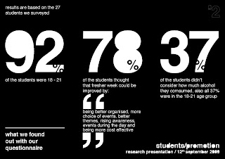
Here are two slides from my research, the general graphic style runs all the way through the presentation, enjoy.


A Field Trip (Part 2)
I have split this into as the last post was getting a little long.
The second part of the trip was really interesting and really open up my eyes to possibilities of interaction and product design. The Helen Hamlyn Research Associates, which was at the Royal College of Art was full of research led projects. The designers didn’t have an idea of what they were going to design, they did a huge amount of research and come to some interesting results.


The piece that really stood out for me and I think everyone else was a mobile phone start up handbook for older people. The designers found that old people just wanted some to explain the set up clearly rather than having a new device design especially for them. Also they created cards, that use similar technology as an oyster. The cards have the path to a function on the phone saved to them, such as the camera or write a text message, which when placed over the phone the relevant application on the phone will open.
There was some really interesting projects and solutions to help people. you should check out the website.
Saturday, 10 October 2009
A Field Trip (Part 1)
On the first week we went on a field trip to the design museum and an exhibition from The Helen Hamlyn Research Associates, which was at the Royal College of Art
I will start with the Design Museum the main exhibition was ‘Super Contemporary’. Which was a collection of commission by some of London’s best designers, which included Neville Brody, Paul Smith, Wayne Hemmingway (I have heard some goods things about him from old work place, little joke there for the people I used to work with) and many more. It included a timeline, which was really interesting, as I don’t much about the history of product design. It also had the history of graphic & fashion design, Architecture and a culture time line, which included film, music, social and political events of that year.
All quite interesting to see have all these things contributed to each other and there was some interesting videos of people talking through their experience career. All well worth a fiver… and I also got mistaken for the course tutor, must be the beard…
There was also another exhibition by a Spanish (I think he was extremely Spanish) his name is Javier Mariscal. His work is quite interesting not quite to my taste he has designed a graphic identity for Barcelona (one of my favourite cities). His work spans many disciplines he makes models out of cardboard, he is a film maker he seems to do the lot, check him out…
Wednesday, 7 October 2009
The First Brief is in!!!!!!!
Anyway back to the brief, sound quite interesting. there is no set object we have to design, so it is the openest (don't know if that is a word) I ever had. It is exciting but also very daunting.
We are in groups might feel like the apprentice, I bet there is someone wanting to take control or people cant be bothered so some one has to take control. Then when the tutor says its rubbish we can blame that person, should be a laugh.
Can’t wait to find out…
I will post my progress in the next few days!
Sunday, 20 September 2009
Me
I think most designers have the problem of creating a logo / identity for themselves. I think it one of the hardest thing to design like most designers I am very self critical of what I produce. So here are some questions I asked myself:
What does it say it about me?
Does it look good?
Will I like it in a year?
Will take me seriously?
These kind of questions are easy to answer when you are designing a logo / identity for a client. I have thought about these questions for years and never really got around to answering them. I have had many ideas, which include designing a coat of arms with monkeys it was a bit tongue in cheek and looking at it didn’t really work for me. Mainly I thought that people would really take me seriously. After the monkey thing I decided to go down a more retro look using a William Morris inspired leaf design which now I think doesn’t really work either.
But now I think I have found something that is simple, visually clever and usable for a logo, I had the idea way back in college (I recently found my sketchbook with initial ideas) at the time I didn’t rate the idea too much.

I decided to go back to the idea after going to a D&AD President Lecture that involved Experimental Jetset. After seeing the project for Réunion des Musées Nationaux, I thought my idea could work and be quite successful with a little work.
So logo on its way, onto the website, letterhead, business cards... etc… might come back to that in another 3 years…


