Tuesday, 30 November 2010

What an Experience

My last project was a group project (with graphic design students) and we had to design an experience for a couple who are 55-60, who are visiting the O2 to watch AC/DC’s final show. Oh and arriving in a limo.


The project started off pretty well, we had a pretty strong group. Then it started to slide slowly, first of all the research stage and not everyone pulled their weight. I think that the graphics students didn’t realise how important it was to understand our user and to design an experience that relevant to our user.


So, we designed a new VIP experience and decided to go down the route of keeping the emotional high through the whole experience and nostalgia, also we would have an interactive experience that would allow the user to have a journey with AC/DC. The user would receive a package with ticket around a month before to get them thinking about the experience. The user’s ticket would use RFID technology to allow the user to record information that would be compiled into a personal journal (personalised booklet) that could be treasured.


The idea included a timeline in the journal that would have key dates of AC/DC along with information from the user. The user would scan their ticket to register who they are and then allow the user to supply information on interactive screens which allows the user to type in the information. Key questions would be asked to gain the information for the user’s timeline, this would allow the user to see their journey with AC/DC.


The experience would also have little interactive activities peppered throughout. In the limo the couple would be able to play AC/DC Rock Band also there would be an option to take photos in the limo that would be presented as photobooth style photos. In the O2 VIP lounge the couple would walk around the interactive exhibition finding out facts, watching videos and looking at rare photos. There would be a Xbox Kincet activity where the user would be able to choose the era and then control Angus Young through a AC/DC song.


Our group began to stall a little on our idea and progress was very slow. With a week left before the deadline we were in a little bit of bother. But everyone pulled it around and we done quite well in our final presentation.


Our man on our branding was Jelani Pomell also he helped create the final journal along with Daniel Place. The initial package that the user receives was designed by Luke Petty, Jelani and Daniel. The ticket was design by Marcel Fortune, he also had a hand in the design of the interactive screen stand with Pete Kuznicki. The interfaces was designed by Tom Holmes. I designed our experience and interactive activities through our experience.


Below are some key areas from our presentation.


There are a few little bits that I not happy with but I suppose that is apart of working in a group… enjoy.


Tuesday, 23 November 2010

Solid Work

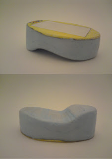
Here is 3D model I made in SolidWorks for my current project.

more info to follow as the deadline is Thursday and there is still
work to be do.

hope you enjoy


Friday, 19 November 2010

Open Shop, Internet Week

Hello


Long time no speak…


I had the pleasure of visiting some digital design agencies that I wasn’t aware of before. I would like to thank Poke, Digit & Somethin’ Else for an afternoon of wonderful ideas and lovely projects. The agencies were very welcoming I even got a cup of tea at Poke.


First I went to Poke, at the Biscuit Building, they do a lot work online. They focused on their newest project, which is Balloonacy, for Orange. It is a race on across the internet, sounds crazy but it is brilliant. When people explain that is a race across the internet, people sort of look at you blankly and then screw their face up and say “What?”, I cant imagine what is was like for the designers explaining to people. But the execution is simple which make this project so lovely.


Secondly we went to Digit near Brick Lane. These guys do more stuff that I understood with processing (coding). They had some nice projects too, one that stood out was Bob the Lamp. Bob’s mood would be dictated by the RSS feed of the BBC website, the good news there was Bob would be upright and bright but when it was bad news Bob would be down and blue. I liked this as it made me smile and I think that is a big part of interaction design. It was simple and gave an object a personality, which I think is brilliant.


Lastly went to Somethin’ else design, I felt sorry for the person (Paul Bennun) showing us round because it was 6 o’clock and I bet he wanted to go home. He was a really nice bloke, he showed us round the building. They had an array of recording studios for live interactions, which seems pretty cool and they had a huge amount of editing suites. Paul also managed to show a few projects they were working on which involved a website called “Super Me another cool idea to help teenagers be better at life by watching videos, playing games and other activities. Each time you play a game or watch a video your attributes goes up and you can share this on facebook. This a really lovely idea to get teenagers to realise they are not bad people but they are learning and might need a bit of help along the way.


All these agencies have much more going on than I have explained, I urge all of you to check them out.

Twitter, ahh how Tweet

I have become a member of twitter in order to present on the web, if your interested here is my call sign...

@Keir_Royale83

Monday, 28 June 2010

The Blog Suffers…

Hello there, you may of notice that the blog has been neglected over the past 2 months. This is because I have been working since leaving Uni, which hasn’t left me enough time to update this poor old blog.


Over the summer I hope to launch a website and continue working, so updates maybe few and far between.


Until I find something interesting to blog about.

adios

Experience Working

For 2 weeks in June I was on work experience at a interaction company called Random International. They are considered artist, but I think deep down they don’t like that title, I think they would rather be referred to as designers.


They produce awesome interactive pieces that mainly react to sound and movement. Hopefully I will be going back there for a bit over the summer.


Check them out at their website also they have video on vimeo

Welcome to The Machine

For the final project at uni we had to produce a machine that is started by human touch, then every action had to start another action. We had to have a physical element and a digital element as well.


The project was more about prototyping from the initial working models to the final object.


I decided to make my machine pretty big, it was a meter and half by a meter. It had 5 different actions, I would start the machine by ringing a mobile with a golf ball balance on the top of it. The ball would then run down some pipe to a box that was connected to a piece of wood that was holding up a hammer. When the ball goes into the box the string would pull the piece of away from the hammer and would cause a vibration on the shelf.


Another piece of wood falls from the shelf due to the vibrations with that a piece of acrylic, that is attached to the wood, falls from a pipe to release a ball that would run down the behind my laptop and start an animation that was of a ball falling into cups and would run off the other side of the screen that would release another ball that would fall onto an iPod to play a random song.


There would be a video of this process but due to unforeseen circumstances (and not having time to test the machine as a whole) but I do have images of the final machine. I decided to keep it the look of the machine very miminal with just a hint of colour from the 3 pieces of wood used. Also the boxes were made from acrylic to give a clean look.


Monday, 5 April 2010

Code Name: Public Toilets

We were given a brief of coming up with a design solution for a public toilet. Yes, PUBLIC TOILETS!!!!!!!!!!!! We were asked to research human behavior within a public toilet, how people use the space and facilities within a public toilet. We had to use video research, which I wasn’t most comfortable with, but we managed to get footage.


I took it upon myself to see what it would be like to use a Public toilet blindfolded. It was pretty horrible. I was touching everything and not knowing what you were touching and how dirty the space is can be quite disconcerting. I didn’t get to talk to any blind people, which was unfortunate, so I couldn’t get a view from a blind person on how they use a public toilet.


After doing that video I decided to design a navigation system for blind people to use in public toilets. I decided to design an app for an iphone. AN IPHONE FOR THE BLIND, I hear you cry. Well, I did a bit of research and found out that blind people own iphones and is recommended by the RNIB as suitable phone for the blind, due to the fact it has a speech functions as most Macs do.


The purpose of this application is guide the blind around a public toilet through photo recognition, using a camera on the iphone. The application will help the user to touch less surfaces in the public toilet, also it will locate and guide the user the available facilities. It will give the user warnings of hazards such as water or toilet tissues on the floor. The user will be warned by a bleeping sound so they can avoid the hazard or obstacles.


The features include:


Recognition of facilities in public toilet such as urinal, cubicle, hand dryer and paper towels


Guides you to nearest available facility


Warns the user of hazards and obstacles in public toilet


Tells the user how many people


Thursday, 4 February 2010

A quick one while you was away…

At the start of the week we were giving a mini project to be completed by Thursday. The brief was to think about the Ravensbourne’s move to the new site next to the 02, we had to pick a concern of the new site and come up with a feasible idea and a “blue sky” idea.


One concern me and partners had was the lack of parking spaces, Ravensboure has no parking at the new site but it is more accessible by public transport (doesn’t mean your going to get there on time). Our feasible idea was to construct a floating car park on the River Thames.


Here is our proposal (some nice sketch up model from esteemed colleague Ben King)…


Our “blue sky” (said though gritted teeth) idea is to have a robot locker that will follow students around campus to help them carry their equipment, give them live updates on their schedules, travel, events that are happening in the university.


These updates will be tailored for the individual using the robot, these preferences will be loaded when the user scans their thumb to start operating the robot.


Below is a more detailed description on the final sheet (I think the architect came out in me, I have hang around their kind far too long)…


Project Lidl

Hello again, I have had feedback for my project for Lidl, the grade was B+ because of two minor (human) errors. The final presentation sheets that were done were not big enough and some of the information was not legible. The final model was not finished to a high enough standard, which was a bit frustrating but never mind you live and learn.


But overall the feedback was very positive. The project was described as “very strong for this stage in your studies”. So there is a silver lining for you!


So I am happy with the outcome but those few minor things can be sorted. We still have to hand in technical drawings and I think we have a chance to hand in a better model, so the grade might be bumped up, who knows?


More details of the product and the service can be found on the image below…


Monday, 18 January 2010

New Brief Alert!!!!!!!!!

We have a new brief, which is about brand factors. This brief consists of analysing a given brand, the brand my partner and I had to analyze is Lidl (oh what joy!). First of all we had to deconstruct the brand from culture (heritage) to projection of customers.


From our brand analysis we came up with a brief of, “How do Lidl keep their new demographic of customers they have acquired through the recession?”. We know that a number of new customers who shop at Lidl may have not of shopped there before the current financial climate.


What is the big idea, I hear you cry?


Well the big idea is to design an online community, where people can share information about Lidl’s products, recipes, recommendations, review products. In store you will given a hand held device that you log onto using a fob with a barcode, it will then show w welcome message from the manager and show you the staff who are working, this will hopefully give Lidl a more friendly atmosphere and make the customer feel special.


After the welcome screen you can access a list of products that you purchased on you last visit and tell you if those products are available, as Lidl don’t always have the same products from week to week. There would also be a map of the store location those products to help the customer a easier shopping experience.


That is an overview of our idea, should be a really good once we design what the screen will look like mean while here are some pics of the prototype…


The Blog Remains The Same

Hello…


A new year, a new decade and I still can’t keep up to date with my blog. Before I said that I would have some news on my website… I have no news due to work commitments over Christmas.


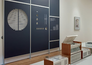
I managed to take a few exhibitions over the festival period. First of all I went to The Design Museum to see the Dieter Rams exhibition, Less and More – The Design Ethos of Dieter Rams. I was really impressed with whole exhibition, it gave me a really good idea of how product design can be so simple yet effective. Even the graphics for the exhibition was excellent, Bibliotheque’s graphics fitted so well with what was exhibited. One thing I thought I would never say is that the best item there and what I got really excited about was a door handle, the way it fitted the hand was just so impressive.


I was also impressed with a little section at the end that showcased a few designers influenced by Dieter Rams. Joe Doucet designed some really nice stuff for Braun, especially a toaster. Sam Hecht, is another designer I really like, I really like his travel alarm clock called Jetlag.